Some of you know that I work with other companies and brands, as an Art Director and or Senior Set stylist. Its fun but hard work, and most of the time, I can’t even show it off because it hasn’t aired on commercials,T.V., or print yet. This particular set was used for HSN, and was for the rebranding of the HSN image. We had the task of creating several different sets for the two week shoot, and this was all done inside of a huge warehouse.

Luckily with large jobs like this, you get to work with and meet some pretty amazing people. We worked with some great models, fashion stylists, makeup artists, directors, camera & lighting crews. It is no little task to make a warehouse go from well.. a warehouse, to a full set.
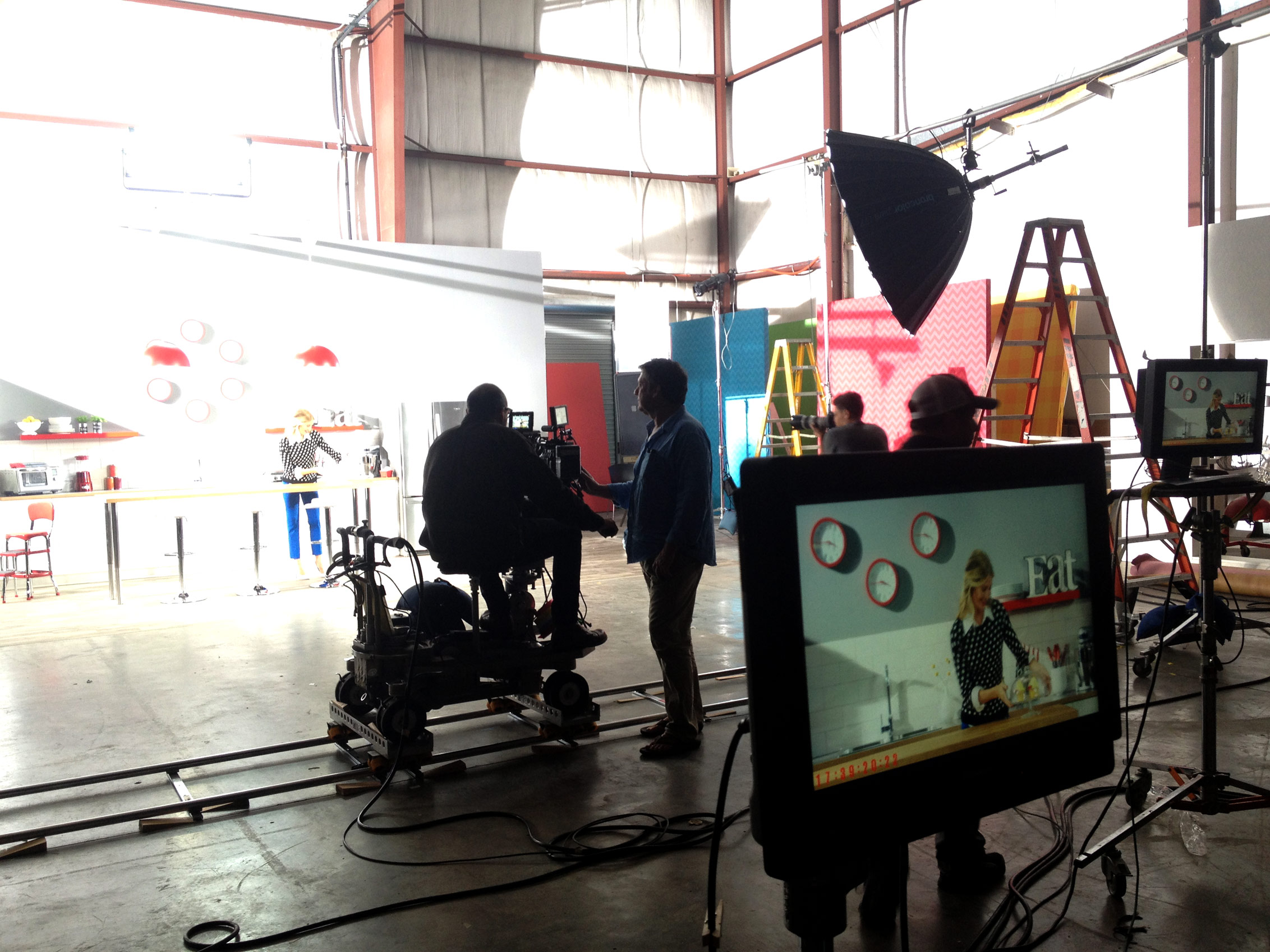
What I love about this design is the use of simple colors, clean lines, and a touch if whimsey. The scenic carpenter and I made sure everything was symmetrical & spotless. When a director wants something camera ready, that means its time to get all OCD and make sure every ounce of dust, debris, and gook is done. No fingerprints here. And it sounds like an easy task until you’re working with stainless steal and about 80 people continually walking into your set.
Red is is a color that can be pretty bold, especially when paired with the white. The cabinets, countertops, shelving and hardware are all from Ikea. The lighting and chairs were special ordered. The props on the shelving are from Homegoods, and the clocks are from target. Did any of you notice the clocks all have the same time?! Its those little detail that we keep track of!

So what do you all think of the design?? Its a little more modern and contemporary for this client. Let me know what colors your kitchen are! As always, Happy Decorating!
Chelsea
*photos are owned and used by HSN,
Photography by Bryan Kasm bryankasm.com
155 Comments on All Things that Shine (in set design)
Leave a Reply
You must be logged in to post a comment.
sildenafil pharmacy sildenafil without doctor prescription
cheapest sildenafil cheap generic sildenafil
tadalafil for sale buy cheap tadalafil
buy generic drugs online from india buy generic drugs from india
cheap generic sildenafil cheap sildenafil
buy generic drugs online from india generic drugs from india
payday loans direct lenders personal loans for bad credit
payday loans personal loans
instant online payday loans payday loans online fast deposit
dapoxetine 60mg uk https://salemeds24.wixsite.com/dapoxetine
buy tadalafil tadalafil pharmacy
buy generic drugs cheap tablets best place to buy generic drugs
payday loans personal loans
cheapest sildenafil cheap sildenafil
sildenafil online buy sildenafil online
buy tadalafil online cheap tadalafil
generic tadalafil tadalafil online
cheap generic sildenafil buy sildenafil
compare pharmacy prices for prescriptions buy generic drugs
https://prednisonegeneric20.com/ buy prednisone mexico
https://amoxicillingeneric500.com/ amoxicillin generic brand
https://zantacgeneric150.com/ zantac 150
https://doxycylinegeneric100.com/
https://zantacgeneric150.com/ buy zantac
https://prednisonegeneric20.com/ prednisone for sale without a prescription
https://amoxicillingeneric500.com/ can we buy amoxcillin 500mg on ebay without prescription
https://doxycylinegeneric100.com/
https://valtrexgeneric500.com/ valtrex rx
https://zantacgeneric150.com/ zantac coupon
https://amoxicillingeneric500.com/ amoxicillin 875 125 mg tab
https://ventolin100mcg.com/ generic ventolin inhaler
https://zithromaxgeneric500.com/ zithromax capsules australia
https://valtrexgeneric500.com/ buying valtrex
local generic dapoxetine https://dapoxetine.confrancisyalgomas.com/
ed treatment review ed drugs over the counter the best ed drug
canadian online drugstore
vacuum therapy for ed buy prescription drugs without doctor buying ed pills online
cheap erectile dysfunction pill
treatment for erectile dysfunction https://canadaedwp.com/ cvs prescription prices without insurance
cause of ed ed drugs over the counter ed solutions
vacuum pumps for ed
medications online canadian drugs online erectile dysfunction treatment
erectile dysfunction medications
drugs online ed drugs over the counter cheap erectile dysfunction pills online
male enhancement
google viagra dosage recommendations best online canadian pharmacy canadian medications
muse ed drug canada ed drugs prescription drugs online
natural cure for ed
herbal ed remedies ed pills online pharmacy mens erections
walgreens bimatoprost coupon https://carepro1st.com/
best erectile dysfunction pills canada ed drugs ed meds online pharmacy
how to help ed
natural ed ed medications online vitality ed pills
100mg viagra without a doctor prescription best ed pills cheap ed pills
medications online
best drugs for ed https://canadaedwp.com/ best ed pills
ed drugs top ed pills errectile dysfunction
pills for ed best ed pills buy ed drugs online
treatment of ed ed drugs over the counter help with ed
best erectile dysfunction pills
ed medications list buy prescription drugs without doctor male erectile dysfunction
the canadian drugstore
online prescription for ed meds buy ed pills online best canadian pharmacy online
best medicine for ed best canadian online pharmacy best ed treatment pills
how to overcome ed
cialis money order buy cialis real cialis without a doctor’s prescription
п»їcialis
generic for cialis generic cialis real cialis without a doctor’s prescription
canadien cialis buy cialis online cialis before and after
viagra vs cialis vs levitra cialis online real cialis online with paypal
the effects of cialis on women cialis dosage when is the best time to take cialis
cialis dosages generic cialis how to take cialis
nose congested when taking cialis generic cialis cialis ingredient
lowest price cialis generic cialis canadien cialis
real cialis without a doctor prescription
is cialis generic available cialis vs viagra effectiveness how often to take 10mg cialis
hard erections cialis cheap cialis cialis coupon
average price cialis generic cialis when will cialis go generic
prices of cialis generic cialis cialis free trial
free cialis medication for providers buy cialis cialis 30 day sample
canadien cialis cheap cialis lowest price cialis
online canadian drugstore generic ed pills ed pharmacy
best pills for ed buy prescription drugs online legally legal to buy prescription drugs from canada
buy prescription drugs from india generic cialis home remedies for erectile dysfunction
prescription drugs canada buy online generic ed pills natural treatment for ed
ed help cheap ed pills treatment of ed
ed drugs online generic cialis drug pharmacy
ed doctors ED Pills Without Doctor Prescription google viagra dosage recommendations
erection pills online cheap ed pills online ed drugs
drug store online cheap ed pills prescription drugs online without
ed tablets ED Pills ed remedies
real viagra without a doctor prescription ED Pills Without Doctor Prescription online ed drugs
treating ed ED Pills ed pills comparison
how to overcome ed naturally generic cialis generic ed pills
ed medicine ED Pills Without Doctor Prescription ed meds online
supplements for ed cheap ed pills over the counter ed treatment
how to overcome ed naturally Cheap Erection Pills legal to buy prescription drugs without prescription
online meds for ed ED Pills best natural cure for ed
prescription drugs generic ed pills erectile dysfunction medications
ed aids ED Pills medications for ed
prescription meds without the prescriptions ED Pills online ed meds
medication drugs ED Pills new erectile dysfunction treatment
erectial dysfunction generic cialis ed natural treatment
non prescription ed drugs ED Pills Without Doctor Prescription erectile dysfunction treatments
ed pills that work ED Pills Without Doctor Prescription natural remedies for ed
ed products generic ed pills best male enhancement pills
herbal ed generic ed pills canadian pharmacy online
ed meds online without doctor prescription generic cialis natural ed pills
ed help ED Pills Without Doctor Prescription treatments for ed
ed pills cheap Cheap Erection Pills best male enhancement pills
online pharmacy viagra viagra canada generic viagra cost
cost of viagra buy viagra generic viagra over the counter
injections for ed
cheap viagra online buy viagra generic viagra prices
buy viagra cheap ed pills viagra without a doctor prescription usa
viagra prescription online buy viagra online buy viagra online usa
buy generic viagra online generic viagra online is there a generic for viagra
order viagra online buy viagra online canadian viagra
best over the counter viagra buy generic drugs generic viagra without a doctor prescription
cheap viagra online cheap ed pills buy viagra online canada
online viagra buy generic drugs buy generic viagra online
ed drug comparison
no prescription viagra canadian pharmacy viagra canadian viagra
viagra over the counter walmart cheap ed pills generic viagra online for sale
generic viagra without a doctor prescription buy viagra from canada cheapest viagra online
is there a generic viagra generic viagra generic viagra names
best over the counter viagra buy viagra online viagra 100mg price
viagra online canada buy viagra from canada viagra without a prescription
where to get viagra buy generic drugs generic for viagra
online doctor prescription for viagra buy ed pills online viagra online canadian pharmacy
where to get viagra buy generic drugs online viagra prescription
generic name for viagra cheap viagra buy viagra online usa
how to get viagra buy viagra online mexican viagra
viagra without a doctor prescription canada cheap ed pills viagra without a doctor prescription
price of viagra canadian pharmacy viagra viagra canada
website
walmart viagra generic viagra online generic viagra online
when will viagra be generic cheap ed pills viagra without a doctor prescription canada
viagra without a prescription buy viagra viagra prescription online
roman viagra buy ed pills online cheap viagra online canadian pharmacy
viagra price buy ed pills online viagra canada
viagra price viagra canadian pharmacy generic viagra
medicine for erectile ed symptoms canada ed drugs
online ed pills drug pharmacy medicine for ed
how to overcome ed ed pills otc ed problems treatment
ed meds online without doctor prescription ed meds online ed symptoms
drugs that cause ed do i have ed cure ed
viagra without doctor prescription amazon best ed drug ed vacuum pump
homepage ed for men otc ed pills
prescription drugs male ed pills ed treatment natural
buy prescription drugs online best drug for ed ed natural treatment
comfortis for dogs without vet prescription ed cures that actually work best ed pill
discount viagra cheap viagra generic viagra without a prescription
mexican viagra cheap viagra generic viagra no prescription
generic viagra online viagra no doctor prescription viagra cheap
cheap generic viagra viagra for sale viagra without prescription
where to get viagra viagra without a doctor prescription generic viagra india
buying viagra online cheap viagra generic amazon viagra
viagra coupons viagra for sale viagra walgreens
cialis pills buy tadalafil when will cialis go generic
cialis free trial cialis for sale cheapest cialis
canadian cialis cheap cialis generic cialis bitcoin
normal dose cialis tadalafil cialis canada
cialis vs viagra cialis online cialis daily
low cost cialis cialis online what are the side effects of cialis
online cialis generic cialis for sale liquid cialis
cheapest generic viagra cheap viagra how much is viagra
viagra without a prescription viagra online for sale viagra online canadian pharmacy
cheap viagra online viagra for sale cvs viagra
viagra online generic viagra amazon viagra
how to buy viagra viagra for sale roman viagra